
Motiondesigns
A plain cut can be true and still look like it belongs to nobody.

Motion is the moment a number, a name, or a claim shows up at the same time the sentence says it. Then it gets out of the way. It is not a pile of moves added because the timeline felt empty.
The next video uses the same type and the same timing, so people start to recognize you before they read the name.
A move that could belong to anyone
If the graphic could sit on a competitor's video, it is not yours yet.
Templates are fast and they look like templates. A bounce, a swipe, a stock lower-third. People have seen that exact move on a hundred other accounts. It does not make you look produced. It makes you look rented.
We start from the brand you already have. The type you use. The colors that are actually yours. The speed that fits the way you talk. A sharp brand does not ease in like a children's app. A quiet one does not slam.
Recognition is the point
After a few videos, someone should be able to cover the logo and still know whose feed they are in. If they cannot, the motion is decoration and the brand is still starting from zero every post.
When motion helps, and when it gets in the way
More movement is not more professional.
A number that lands as you say it helps. A name that sits still while you talk about it helps. A background that never stops moving does the opposite. It asks the eye to work on something that is not the point.
We move only what the line needs. If a frame is already clear, it stays still. Stillness next to one good move is what makes the move read. A video where everything animates is a video where nothing does.
Type has to be readable at phone size
A clever lockup that cannot be read is a failed graphic.
Shorts and ads are watched small. A sentence set in a thin font, over a busy shot, with a shadow fighting the picture, is a sentence people skip. They do not pause to decode your layout.
We set the words at a size that survives a phone, in a place the face or the product is not using. One idea per card. If the line needs a second card, it gets a second card. Cramming is how a clear offer becomes a blur.
The same system, the next video
Once the type, the color, and the timing are decided, the next piece is faster and it looks related. Starting the graphics from scratch every time is how a brand stays inconsistent and how the edit takes longer than it should.
A slideshow with movement is still a slideshow
Sliding a bullet point does not turn it into a film.
If the video is five text cards in a row, no amount of easing will make it feel like a brand. The pictures have to do some of the talking. The text confirms what the picture already showed.
That is the difference we cut for. The graphic arrives to name the thing you are already seeing, not to replace the picture because there was nothing to show.
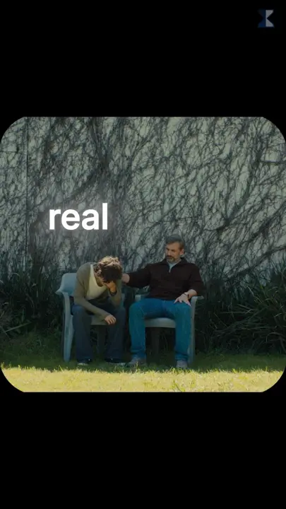
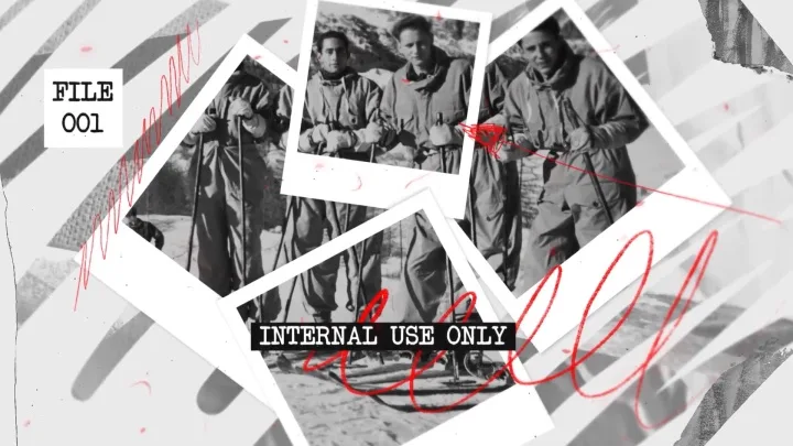
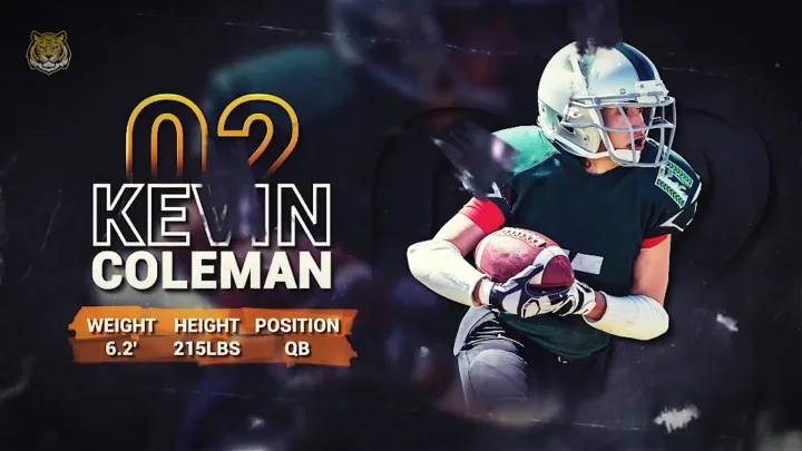
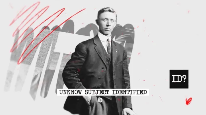
Motion designsin the wild
Tap a clip to watch it with sound.
Keep exploring
Start with whatyou already have
Send the files or the idea. We reply with how the job would actually go.